Defining Cell Drop-downs
You can add a drop-down menu in the cell to help users select the data easily and quickly. This feature is helpful in creating input form controls, advanced structured forms and other interactive forms and dashboards within the spreadsheet.
You can configure a drop-down cell with a list of predefined values (using a list drop-down); calculated values (using a calculator drop-down); calendars and events (using date time picker, month picker and time picker drop-downs); select a color (using color picker drop-down); create range sliders (using a slider drop-down) and automatically repopulate the next available choices based on the earlier choice (using a workflow list drop-down).
You can define the following cell drop-downs:
-
Calculator: The calculator drop-down allows you to compute values and populate the evaluated result in the cell.
-
Color Picker: The color picker drop-down allows you to choose a specific color to populate the cell value with the hex code of the chosen color.
-
DateTime Picker: The date time picker drop-down allows you to set date and time to populate the evaluated result in the cell.
-
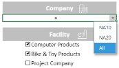
List: The list drop-down allows users to choose a specific item from the drop-down list to populate the cell value.
-
Month Picker: The month picker drop-down allows you to configure a specific month in a year to populate the evaluated result in the cell.
-
Slider: The slider drop-down allows you to add a dynamic range slider in a cell that populates the current value in the cell.
-
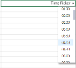
Time Picker: The time picker drop-down allows you to configure a specific time to populate the evaluated result in the cell.
-
Workflow List: The workflow list drop-down allows you to select a workflow item easily and quickly to populate the chosen value in the cell.
-
Multicolumn List: You can create a drop-down list as well as an editable area which will allow you to type in the value as well as choose from a displayed list. You can scroll the drop-down list and select an item. The item value will return the current cell value as the object type, and when you re-open the drop-down list, the selected item will be highlighted.
To create a drop-down list
-
In the Home menu, select Styles > Cell Editors > Cell Dropdowns and then select your drop-down type.
-
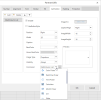
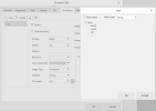
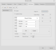
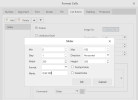
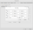
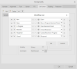
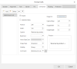
The Format Cells dialog box opens with the Cell Button tab selected. All drop-down features use the same parameters. Some drop-downs use additional parameters. The other tabs provide the standard formatting parameters.
Enter the Cell Button parameters as described below.
-
Click OK.
| Parameter | Description |
|---|---|
| (button list on the left) |
Displays the button selected in the Command drop-down list. It reflects the value of the item you selected in the Cell Dropdowns menu. Click Add to add more buttons and select the command you wish to assign to each button. |
| UseButtonStyle | Select this option to give the cell a button look. |
| Position | Specifies the position of the drop-down in the cell. |
| Width | Set the width of the drop-down in the cell. |
| Caption | You can enter text here to describe the drop-down. |
| BackColor | Specifies the background color of the drop-down. |
| Hover BackColor | Specifies the background color of a drop-down item when your cursor hovers over the item. |
| Image Type | Specifies the icon type on which the user clicks to view the drop-down. By default, Dropdown is selected (in form of a down arrow). You can change the icon type by selecting one from the list. |
| Visibility | Specifies if the drop-down is always visible, or on selection or edit only. |
| Command |
Has the type selected by default according to your Cell Dropdowns menu choice. You can change the command if you made the wrong selection without having to reuse the menu.
|
| CaptionAlign | By default, the caption appears to the right of the drop-down icon. You can change the caption alignment and put it on the left. |
| Image Src | You can use an image file instead of the default icon by clicking this button. This feature is not enabled for this release. |
| Image Width and Height | Specifies the icon size inside the cell. |
Calculator drop-down example
Color picker drop-down examples
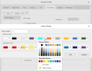
Here we change one of the theme colors to turquoise.
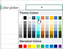
After saving, the turquoise color is available from the theme colors when you click the cell.
The hexadecimal value of the color is then displayed in the cell when selected.
Date and Time picker drop-down example
Here we selected the UseButtonStyle parameter and blue as Hover BackColor.
List drop-down examples
Example after clicking the ellipsis button.
Here we clicked the Edit option at the level of NA10.
This is the result of a drop-down list.
Month picker drop-down example
Example after clicking the ellipsis button.
This is the result of a month picker.
Slider drop-down example
Example after clicking the ellipsis button.
In this example, the minimum value is 0 and the maximum is 100. We used 0,50,100 as marks.
Time picker drop-down example
Example after clicking the ellipsis button.
In this example, we selected 30 minutes as the step (time interval) for the drop-down. The time is in 24-hour format.
Workflow list drop-down example
Example after clicking the ellipsis button.
Since New is the first item on the list, it is the first choice that appears when clicking the list.
Once New is selected, the next item available is Open, and so on.
Multicolumn list drop-down examples
Example animated with steps.
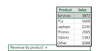
Example with a caption (Revenue by product).
To edit a cell drop-down
-
Right-click the cell.
-
Select Edit Cell Drop-down.
-
Make the changes as described in the above-mentioned procedures.
To remove a cell drop-down
-
Select the cell.
-
In the Home menu, select Styles > Cell Editors > Cell Dropdown > Clear CellType.

