Payroll Executive Overview Dashboard
The Payroll Executive Overview Dashboard gives leadership a clear, data-driven summary of payroll performance over time. It makes it easy to compare current payroll metrics against the previous year, monitor growth, identify cost drivers, and inform financial decisions. Visual variance indicators provide instant clarity and drive data-informed action.
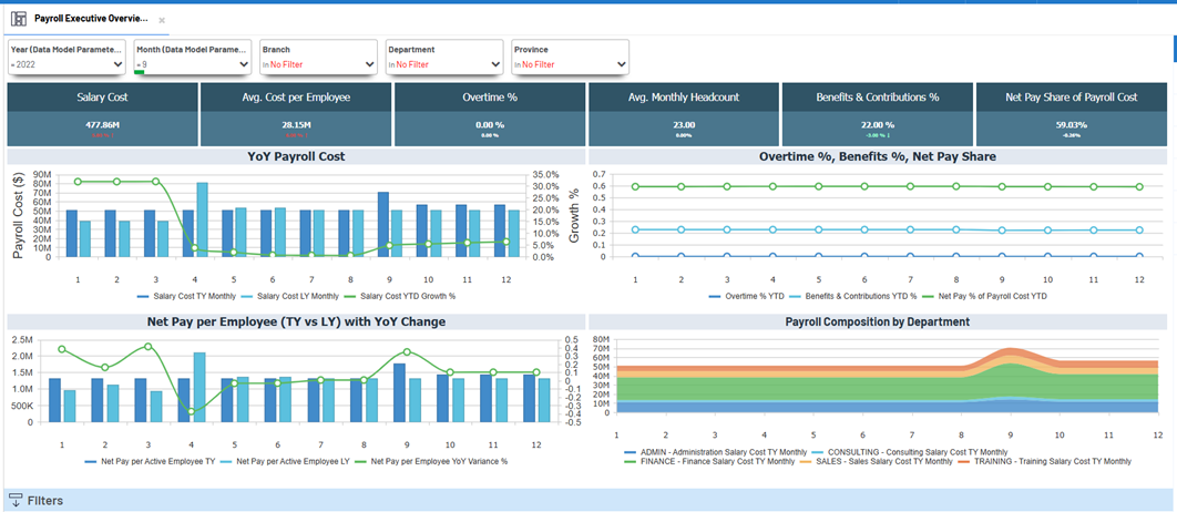
This dashboard presents strategic metrics with detailed year-on-year comparisons and dynamic filters, helping leadership manage payroll costs efficiently while aligning with workforce goals.
Key metrics at a glance
| Metric | Description |
|---|---|
| Salary Cost | Total payroll expense for the selected period. |
| Avg. Cost per Employee | Average salary cost per headcount. |
| Overtime % | Overtime hours as a percentage of total hours worked. |
| Avg. Monthly Headcount | Total active employees averaged over the selected period. |
| Benefits & Contributions % | Share of total payroll allocated to benefits and employer contributions. |
| Net Pay Share of Payroll Cost | Proportion of payroll that is actual net pay to employees. |
-
Red indicates negative variance compared to last year
-
Green signals improvement or cost savings
Benefits of this dashboard
-
Executive Decision Support: Clear KPIs and trends enable confident decisions.
-
Year-on-Year Payroll View: Comprehensive comparison of payroll metrics over time.
-
Efficiency Monitoring: Track cost, employee impact, and pay structure.
-
Workforce Planning: Support strategic budgeting and workforce management.
-
Early Detection: Identify abnormalities or cost spikes across departments early.
Filtering
You can filter data interactively by:
-
Year
-
Month
-
Branch
-
Department
-
Province
These filters allow focused analysis by region or business unit for actionable insight.
Visuals and Charts
The dashboard features dynamic, easy-to-read visuals:
-
Salary Cost Trends: Compare monthly payroll spend (this year vs last year) with growth percentage.
-
Net Pay per Employee: Year-on-year comparison with monthly variance.
-
Overtime %, Benefits %, Net Pay Share: Comparative contribution to payroll.
-
Payroll Composition by Department: Salary cost breakdown per unit over time.
Charts track monthly patterns and use color-coded variance indicators to flag major changes.
Example
The dashboard below displays its structure and layout, as well as a visual overview of key metrics and design.