Leave Dashboard
The Leave Dashboard provides a comprehensive view of leave activity across your organization. HR, payroll, and leadership teams can monitor trends in leave usage, liabilities, policy compliance, and employee behavior. This dashboard supports proactive leave management and operational cost control by surfacing key metrics such as excessive leave accumulation and monthly liability changes.
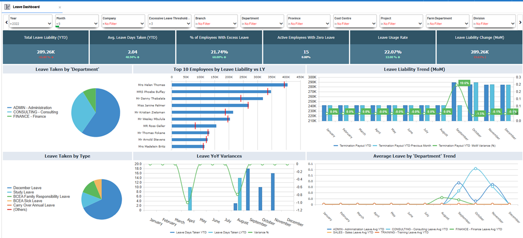
Key metrics at a glance
| Metric | Description |
|---|---|
| Total Leave Liability (YTD) | The total cost (monetary value) of leave accumulated year-to-date. |
| Avg. Leave Days Taken (YTD) | The average number of leave days utilized per employee this year. |
| % of Employees With Excess Leave | Proportion of employees exceeding a defined leave threshold. |
| Active Employees With Zero Leave | Number of employees who have not taken any leave during the year. |
| Leave Usage Rate | Percentage of total leave entitlement utilized year-to-date. |
| Leave Liability Change (MoM) | Change in total leave liability compared to the previous month. |
Benefits of this dashboard
-
Control Leave Liability: Monitor accrued leave trends and prevent financial risks from unused leave.
-
Promote Leave Usage: Identify employees not taking enough leave to encourage healthier work-life balance.
-
Spot Excess Accumulation: Track employees exceeding leave limits to enforce policies and avoid payout spikes.
-
Department-Level Insight: Compare trends across units for cultural or operational differences in leave behavior.
-
Support Planning: Inform resource allocation and scheduling with monthly leave patterns.
Filtering
You can tailor analysis to specific workforce segments with dynamic filters:
| Filter | Purpose |
|---|---|
| Year | Select a reporting year. |
| Month | Focus on specific monthly snapshots or trends. |
| Company | View data by selected companies. |
| Excessive Leave Threshold | Define the minimum days to classify leave as excessive. |
| Hierarchy Level | Filter by any defined organizational level (e.g., cost center, region). |
| Hierarchy Level A | Apply a higher-level grouping for aggregated analysis. |
All visuals and KPIs update in real time as filters are applied for easy isolation and analysis.
Visual Elements
-
KPI Summary Cards
Show headline statistics like total liability, average days taken, usage rate, and percentage with excess or zero leave.
-
Leave Taken by ‘Department’
Pie chart visualizing leave usage breakdown by department or cost center.
-
Top 10 Employees by Leave Liability
Bar chart listing employees with the highest YTD leave liabilities compared to last year.
-
Leave Liability Trend (MoM)
Combo bar/line chart showing monthly liability values and changes to track financial exposure over time.
-
Leave Taken by Type
Pie chart indicating split of leave types taken, e.g., sick leave, study leave, annual leave.
-
Leave YoY Variances
Column and line chart comparing current year leave days to previous year to highlight monthly variance.
-
Average Leave by ‘Department’ Trend
Line chart tracking average leave days taken per department through the year to reveal cultural or operational differences.
Example