Defining Cell Types
Cell types define the type of information in a cell, how that information is displayed, and how the user can interact with it.
You can define the following cell types:
-
Button: You can display a button in a cell and set appearance properties such as color and text.
-
Check box: A check box cell displays a small check box that can have one of three states, checked, unchecked, or indeterminate. You can customize the check box by setting the text.
-
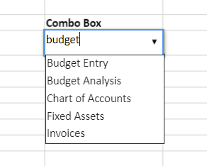
Combo box: You can create a combo box to display a drop-down list. You can also make the combo cell editable. You can type in the edit portion of the cell and the matching item in the list is selected automatically.
-
Hyperlink: You can use a hyperlink cell to contain text that functions as a single hyperlink. You can set the color of the hyperlink and change the color after the link has been accessed. You can display text in the cell that is different from the hyperlink. You can also display a tooltip.
-
Range Template: You can define a template of cell ranges as a single cell type and apply that template to a cell to load different types of data into the template (including multiple rows and/or columns). Once the cell type is applied to a cell or a cell range, the range template will use the cell value(s) as a data source to resolve the binding path of the specified range.
-
Check box list: A check box list is an interactive checklist or a to-do list with multi-selection field values. It displays a group of items via multiple check boxes embedded within a single cell. Users can click the check box in order to select or deselect a specific option.
-
Radio button list: A radio button list allows you to choose and select a single item from a list of options within a cell in the worksheet. It refers to a group of radio buttons embedded within a single cell. You can click the radio button in the list to select or deselect a specific option.
-
Button list: A button list refers to an interactive list with multi-selection values. It displays a group of items embedded within a single cell where one or multiple options can be selected to record end-user response. You can create a button list cell in the worksheet and configure the layout of the items in the button list.

To create a button
-
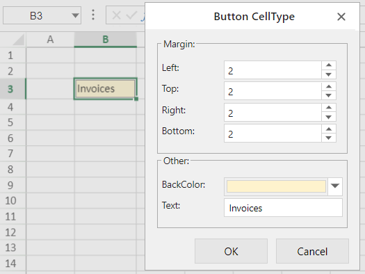
In the Home menu, select Styles > Cell Editors > Cell Type > Button.
-
In the Button CellType dialog box:
-
Specify the size of margins.
-
Choose the background color.
-
Enter the appropriate text.

-
-
Click OK.
To create a check box
-
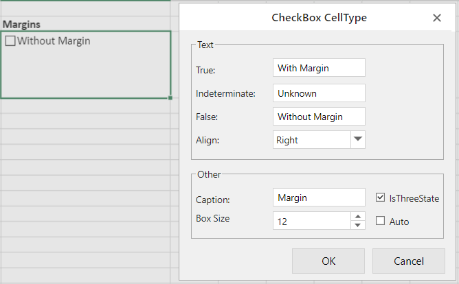
In the Home menu, select Styles > Cell Editors > Cell Type > CheckBox.
-
In the CheckBox CellType dialog box:
-
Specify the states: Enter text in the True and False fields.
-
To add the Indeterminate state, select the IsThreeState option and enter text in the Indeterminate field.
-
Select the text alignment with the check box. The text appears on the right of the check box by default.
-
Set the box size or select the Auto option.

-
-
Click OK.
To create a combo box
If the item width is less than the cell width, then the item width is set to the cell width; otherwise, the item width is equal to the width of the longest item.
The maximum number of visible items in the drop-down list is 20. Use the up or down arrow keys to select items when the drop-down list is displayed. The left and right arrow keys commit the selected item and move to the next or previous cell. The Enter key also commits the selected item and the Esc key cancels the selected item.
-
In the Home menu, select Styles > Cell Editors > Cell Type > ComboBox.
-
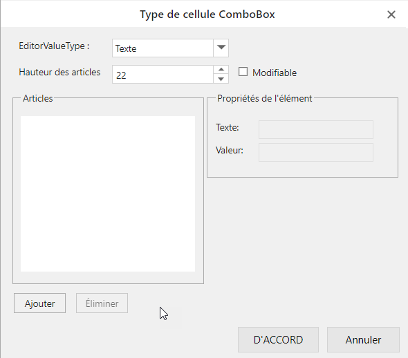
In the ComboBox CellType dialog box:
-
Specify the EditorValueType to get the value that is written to the underlying data model: text, index or value.
-
Set the height of each item in the itemHeight field.
-
Select the Editable option so that the user can enter text in the cell.
-
Click Add to add a list item.
-
Select the list item and enter its description as text and its value in the ItemProperties section.
-
-
Click OK.
Example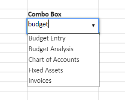
To create a hyperlink
-
In the Home menu, select Styles > Cell Editors > Cell Type > Hyperlink.
-
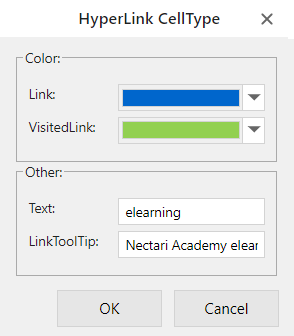
In the Hyperlink CellType dialog box:
-
Select the colors for the link and visited link.
-
Enter the text that you want to appear in the cell (not the actual hyperlink).
-
Enter the tool tip for the link.

-
-
Click OK.
-
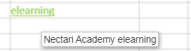
Right-click the cell and select Link....
-
Enter the hyperlink in the Text to display field and click OK.
 Example
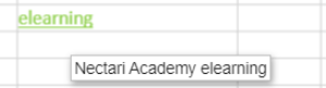

To create a range template
-
Create a template with the appropriate text and formulas in one sheet.
-
Create a data source in another sheet.
-
Select the cells to which the range template will be applied in a third sheet.
-
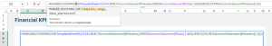
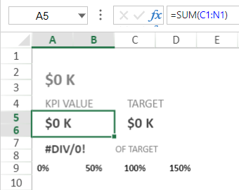
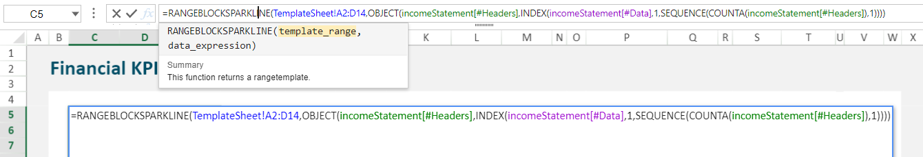
Insert the function to create the range template. In our example, we are using RANGEBLOCKSPARKLINE.
-
In the Home menu, select Styles > Cell Editors > Cell Type > Range Template.
-
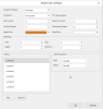
In the Range Template dialog box:
-
Select the worksheet you wish to use a data source in the Sheet Name field.
-
Click the icon the Range field.
-
The dialog box changes shape so you can use your mouse to select the appropriate cells.
-
Click the icon in the Range field again.
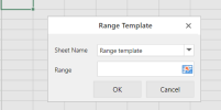
-
-
Click OK.
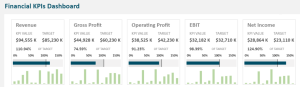
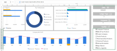
ExampleThe range template takes the values from the data source using the template sheet format.


To create a checkbox list
-
In the Home menu, select Styles > Cell Editors > Cell Type > Checkbox List.
-
In the Checkbox List CellType dialog box:
-
Select the Direction: vertical or horizontal.
-
Select the text alignment with the check box. The text appears on the right of the check box by default.
-
Set the box size or select the Auto option.
-
Set the maximum number of rows and columns in the Row Count and Column Count fields. For example, if you intend to have 9 items in your list, you should have 9 rows.
Note: To keep the same number columns and rows when the cell size is modified, deselect the isFlowLayout option.
-
In the Vertical Space and Horizontal Space fields, configure spacing between the two list items in order to avoid congestion and clutter within the list items inside the cell.
-
Click Add to add a list item.
-
Select the list item and enter its description as text and its value in the ItemProperties section.

-
-
Click OK.
ExampleAs you select items, their corresponding values get updated in the cell and their related figures are updated elsewhere in the dashboard.


To create a radio list
-
In the Home menu, select Styles > Cell Editors > Cell Type > Radio List.
-
In the Radio List CellType dialog box:
-
Select the Direction: vertical or horizontal.
-
Select the text alignment with the check box. The text appears on the right of the radio button by default.
-
Set the box size or select the Auto option.
-
Set the maximum number of rows and columns in the Row Count and Column Count fields. For example, if you intend to have 9 items in your list, you should have 9 rows.
Note: To keep the same number columns and rows when the cell size is modified, deselect the isFlowLayout option.
-
In the Vertical Space and Horizontal Space fields, configure spacing between the two list items in order to avoid congestion and clutter within the list items inside the cell.
-
Click Add to add a list item.
-
Select the list item and enter its description as text and its value in the ItemProperties section.

-
-
Click OK.
Example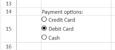


To create a button list
-
In the Home menu, select Styles > Cell Editors > Cell Type > Button List.
-
In the Button List CellType dialog box:
-
Select the Selection Mode: multiple or single.
-
Select the Direction: vertical or horizontal.
Note: To keep the same direction when the cell size is modified, deselect the isFlowLayout option.
-
Set the maximum number of rows and columns in the Row Count and Column Count fields. For example, if you intend to have 9 items in your list, you should have 9 rows.
-
In the Vertical Space and Horizontal Space fields, configure spacing between the two list items in order to avoid congestion and clutter within the list items inside the cell.
-
Select the background color when a button is selected using the BackColor drop-down list. The text will appear in white over the background color.
By default, the foreground color is white but you change it using the ForeColor drop-down list.
-
Click Add to add a list item.
-
Select the list item and enter its description as text and its value in the ItemProperties section.
-
-
Click OK.
Example


To edit a cell type
-
Right-click the cell.
-
Select Edit Cell Type.
-
Make the changes as described in the above-mentioned procedures.
To remove a cell type
-
Select the cell.
-
In the Home menu, select Styles > Cell Editors > Cell Type > Clear CellType.